Role
UX Designer
Flagship Case Study
Modernizing access to saved and resubmission requests in a legacy government filing system.
Enabled scalable access to saved and resubmission workflows while preserving established user behavior in a legacy government system.

Role
UX Designer
Scope
Homepage navigation update and dedicated management workflow
Team
UX, Business Analyst, SMEs, Developers
Contributions
Interaction design, prototyping, user testing, implementation support
Overview
The Online Filing Center supports business users and registered intermediaries submitting federal corporate filings. It is a live, policy-driven system that needs to work reliably for both infrequent users and high-volume intermediaries.
This project began as an effort to improve access to saved and resubmission requests, but it grew into a broader rethink of how common actions should be surfaced on the homepage. My role was to explore possible directions, help shape the interaction model, validate the approach through testing, and support implementation as the work moved forward.
The Online Filing Center homepage followed a structured two-column layout. On the left, users could access core services such as incorporating or filing annual returns. On the right, a narrow panel allowed them to resume saved work or correct a previous filing by entering a Request ID and email address.
That right-side panel had a clear behavioral association: if a user needed to resume or fix something, that was where they went. Any change to that space would affect more than layout. It would affect an established pattern people already relied on.
At the same time, new features were being introduced into the Online Filing Center. Users needed clearer access to saved and resubmission workflows, and the initial business direction was to create a separate dashboard page to house them. The challenge was not simply to add functionality. It was to expand access while preserving the structure and behavior already familiar to users.
The existing Request ID panel worked, but it was limited. Users needed to already have a Request ID and associated email in hand before they could resume or correct a filing.
For frequent users, especially registered intermediaries managing multiple corporations, that created extra steps and unnecessary context switching. There was no simple way to see saved or pending work unless they went deeper into the system.
At the same time, a dedicated dashboard was being considered as a way to surface this work more clearly. That direction offered more visibility, but it also introduced tradeoffs. It would add another navigation layer to a system users were already familiar with, and it risked pulling common actions away from the place users had learned to associate with resuming or correcting work.
The friction was not only about saved work. It was about how to expand visibility without fragmenting the experience or destabilizing the homepage structure.
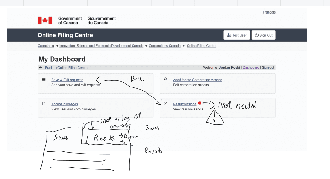
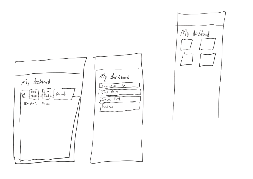
When the idea of a dashboard surfaced, I created a mockup to explore what that direction would look like within the existing system.
The dashboard concept centralized saved and resubmission requests and made them more visible than the original Request ID panel. But once we reviewed it in context, it raised new questions. Would it create redundancy with existing service links? Would users now need to navigate away from the homepage for actions they expected to handle quickly? Was it adding complexity instead of reducing it?
In parallel, I created iterations of the existing right-side panel that explored how save and resubmission access could be improved without introducing a separate destination.
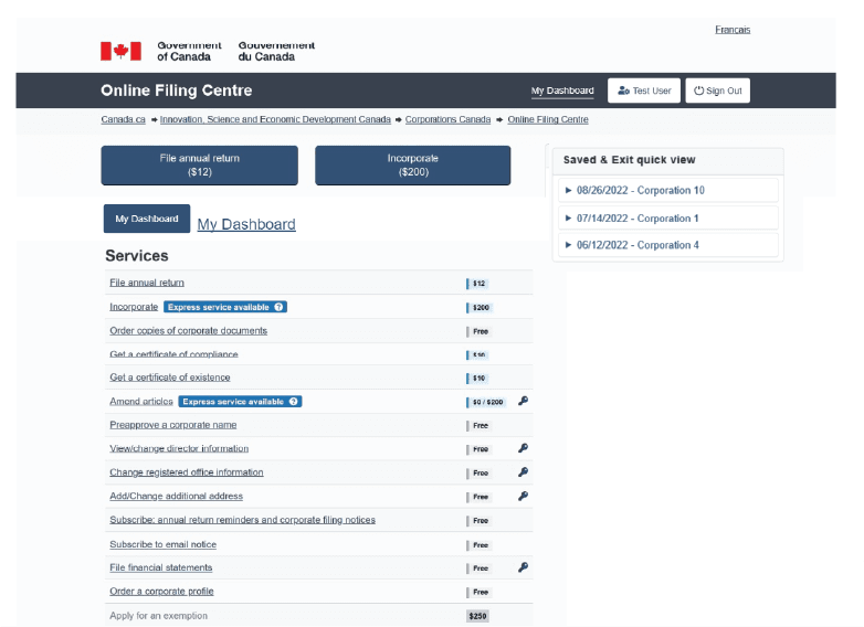
Reviewing both directions with SMEs made the tradeoffs clearer. The dashboard offered visibility, but it also added another layer of navigation. The panel iterations preserved familiarity, but they needed to do more. That comparison helped clarify a better direction: rather than adding a full dashboard page, the right-side column could evolve into a more structured access point that preserved its existing behavioral role while expanding its function.
As the explorations developed, it became clear that improving visibility on the homepage was only part of the solution.
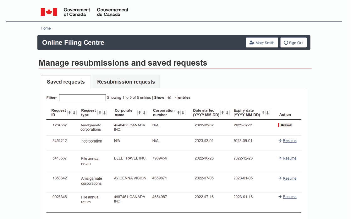
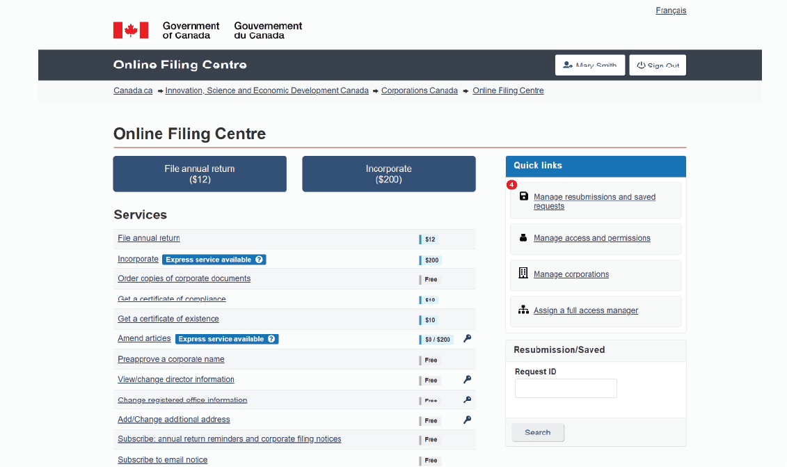
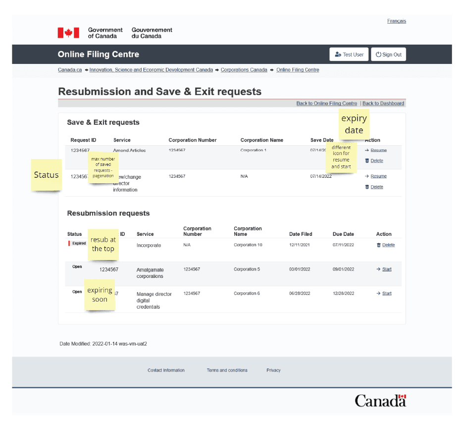
Quick Links could provide more direct access to saved and resubmission requests, but registered intermediaries often manage a high volume of corporations and filings. They needed more than a quick entry point. They also needed a structured space to filter, sort, and manage work at scale.
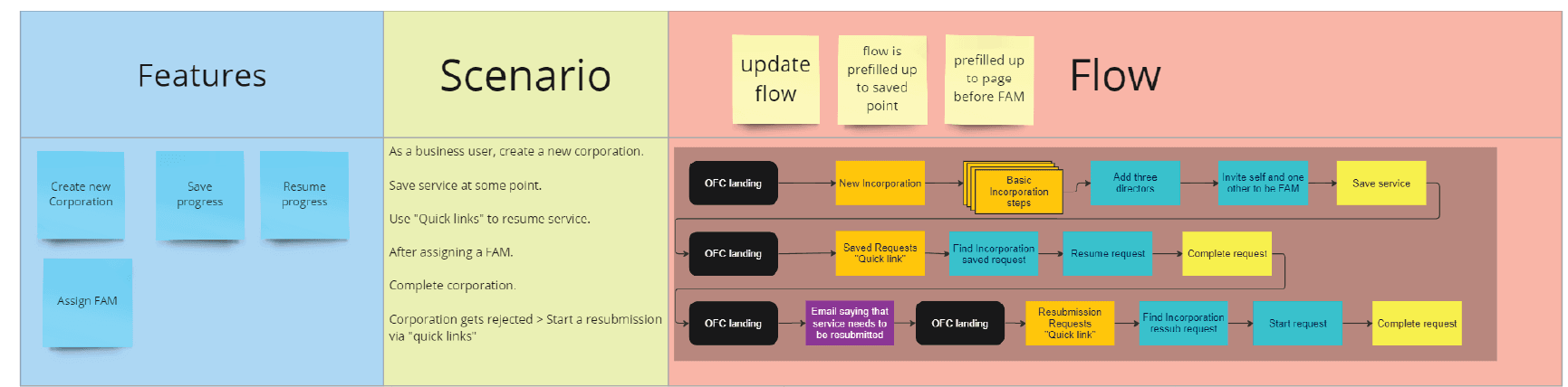
That led to a layered approach:
Through working sessions with a Business Analyst and SMEs, the concept evolved from a focused feature update into a broader structural pattern. Instead of treating saved and resubmission requests as a standalone function, we reframed the homepage column as a place for high-frequency actions that users needed regular access to.
The final Quick Links pattern included access to:
Alongside that, I also worked on the design of the management experience for saved and resubmission requests, giving higher-volume users a dedicated space to view, filter, and resume work more efficiently.
What began as a narrow access problem became a more flexible navigation pattern that supported both quick actions and deeper workflow management.
Once the Quick Links pattern and management interface were prototyped, I collaborated with the Senior Project Lead to structure user testing across two primary groups:
I prepared testing scenarios, flows, and a structured script to evaluate both the homepage access pattern and the deeper management workflow.
The main friction we observed was around the homepage change itself. Small business users, who tended to access the system less frequently, needed more time to adjust to the new Quick Links structure. Because the change affected where saved and resubmission requests appeared, there was a short learning curve.
Registered intermediaries adapted more quickly. Many responded positively to the improved visibility into saved and resubmission workflows and the addition of a structured management page.
One important finding was that intermediaries still wanted the original Request ID behavior retained for delegation scenarios. That reinforced the value of preserving established behavioral anchors even while improving access and visibility.
The testing confirmed that the layered approach was working. It supported both lower-frequency and higher-volume users without forcing the entire experience into a new navigation model.
Once the direction was validated, the focus shifted to implementation.
I worked closely with the development team to help ensure the Quick Links pattern and management interface translated cleanly into the existing Online Filing Center. Because the platform operates within established design and technical constraints, close collaboration was important to preserve both usability and consistency.
To support implementation, I created HTML and CSS examples that developers could reference while building the new components. These examples helped clarify layout behavior within the existing homepage structure, demonstrate interaction patterns for Quick Links, and support alignment between the management interface and the rest of the system.
That collaboration helped carry the design through the practical realities of implementation so the final experience stayed closer to the tested interaction model.
What began as a focused update to save and resubmission access evolved into a broader improvement to how users navigate common tasks within the Online Filing Center.
The final solution introduced a layered access model:
This approach improved access while preserving the established structure of the homepage, avoiding disruptive changes in a system relied on by both occasional users and high-volume intermediaries.
The result was a more flexible access pattern that supported both quick actions and deeper workflow management without introducing unnecessary navigation complexity.